....err, stand. Nightstand, that is.
(I just couldn't resist the Bob Segar reference. And now I'm paying the price; that song has been stuck in my head all day.)
So, last weekend we were doing the thrift store rounds (I think my dream day involves picking up some coffee, a loaf of some kind of fruit and nut bread and trolling thrift stores....where I find an amazing vintage table/painting/ceramic rabbit, which leads me to a taping of Antiques Roadshow, where they breathlessly inform me that my furniture/art/tchotchkes is worth millions!
And then we would go get ice cream.)
While this particular Goodwill trip did not yield our million-dollar find, we did spot this pretty nifty nightstand.
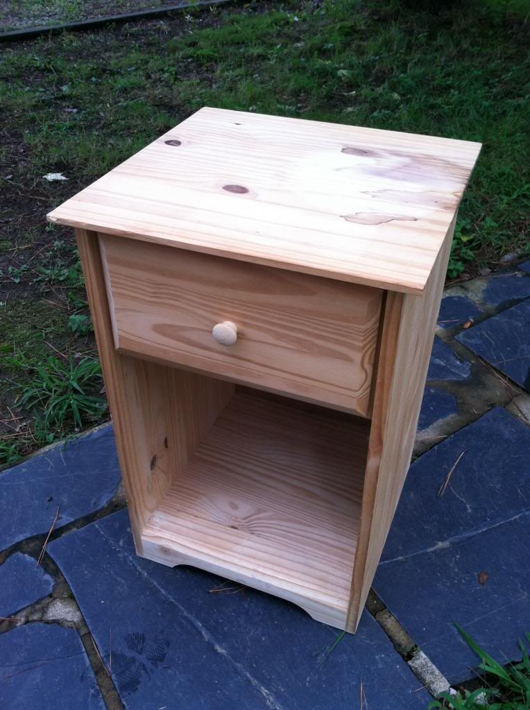
Solid wood. Unfinished. $10.
Sold.
This is where our story takes a turn. Kind of like West Side Story. This first half is all singing and jazzy snaps.
And then somebody stabs Russ Tamblin
And, as far as I'm concerned, that's where the movie ends.
So, if you're like me, you may want to close this browser window and pretend this nightstand story has a happy ending, with Joseph and I dancing around it, ala The Jets in happier times. (Lots of jazz hands.)
I thought it would look great to paint the (poor, innocent) nightstand in the color I had originally intended for the closet.
Close to this:
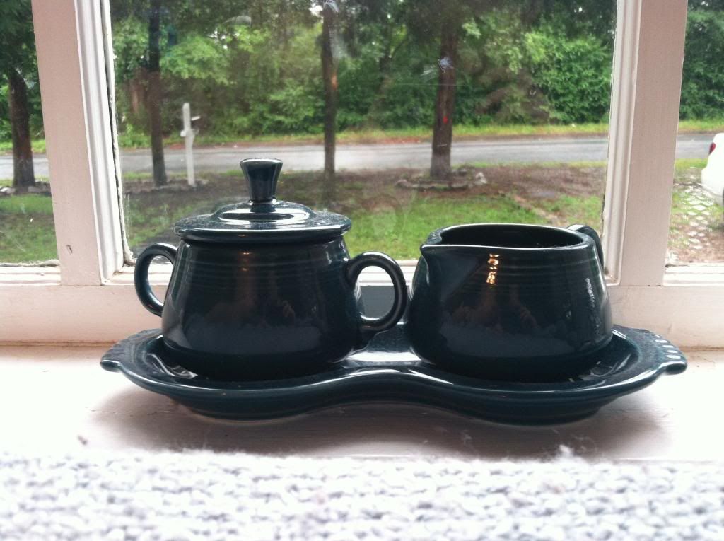
I still maintain that this deep blue-green would look great with our light grey/yellow color scheme.
But I'll probably never know.
This time around, I thought the color I had looked at before (Peacock Tail by Behr) was a touch too blue, so I found something with heavier green undertones.

(Have you gathered that we have a fondness for Behr? We like that their basic flat and eggshell finishes are No VOC and their Kitchen and Bath is Low VOC.)
Because my husband is very supportive, and when I get a project in my head I'm crazy-annoying, the next day he was out front priming and painting our newest addition.


In hindsight, a primer intended for darker paint would probably have been better, but we just used what we had (in fact this step might be solely responsible for our troubles). After one coat, it looked like this:
 |
| Ah that sweet, sweet sponge painted effect. |
And my face looked like this:
 |
| Yay facial expression reenactments! |
Joseph said it looked like it belonged in a doctor's office circa 1992.
But a second coat, a second coat we assured ourselves, would fix everything.
Back to painting.
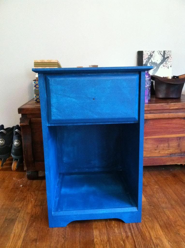
And, in the end, it looked like this:
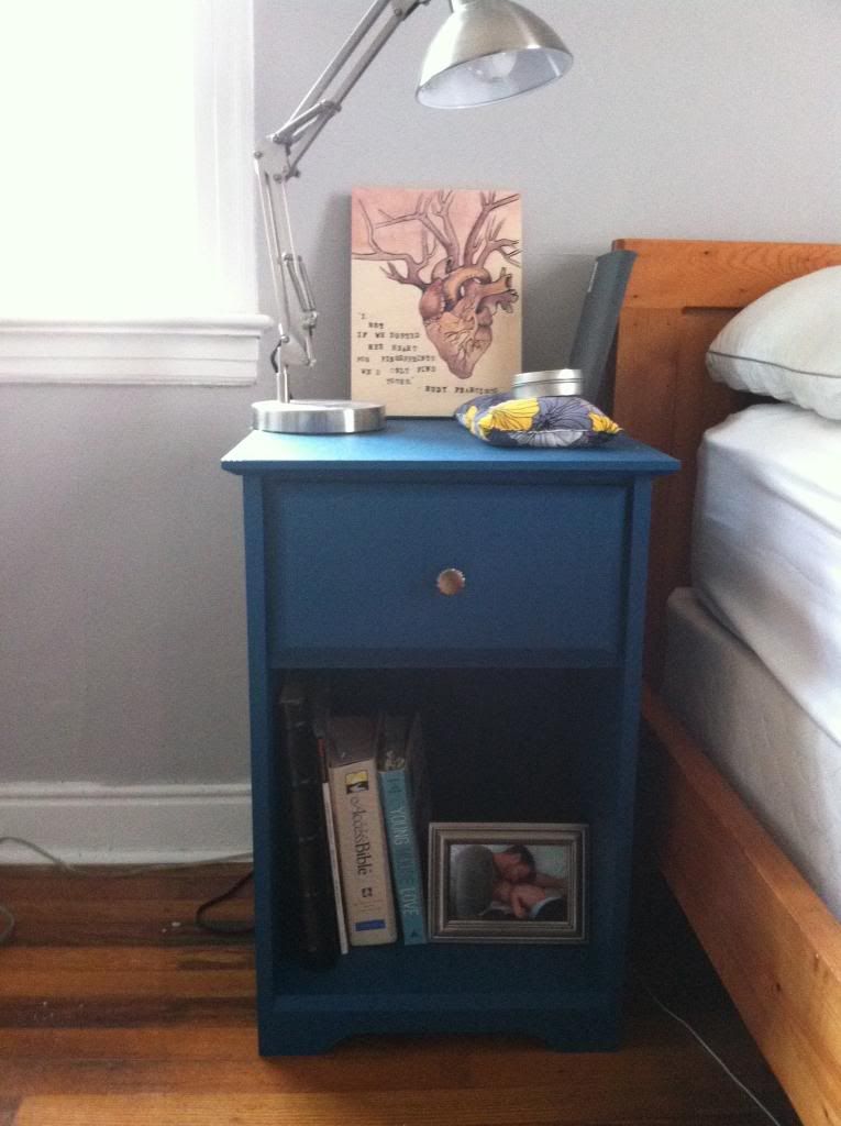
And my face looked like this:

So, not the happy ending we had pictured, but not....terrible. (Kind of like the end of West Side Story. This nightstand is our Maria.)
It's definitely more teal than Juniper. It still has shades of the 1990s. But once we put the knob on and covered it with our junk....it's not bad.
Its not great.
But it's not bad.
Maybe it'll grow on me.
Maybe if I pair it with some faux potted plants, mottled gray carpeting and burgundy office chairs.
*shudder*
I like it! Then again, I love teal ;-)
ReplyDeleteThink it turn out great - true 1990's blues would cause nightmares. :/
ReplyDeleteHaha! Thank you, Jill. You know, I've been watching a lot of 'Friends' lately, I was worried it was subconsciously influencing my taste.
DeleteThank you, Amanda. Joseph used to love teal when he was little; teal and purple. Maybe he sabotaged me...
ReplyDeleteNo, I like it...it just wasn't what I was expecting and I felt foiled.
Teal and purple! That has ALWAYS been my favorite color combination! I have an apron that I made in 7th grade that proves it.
ReplyDelete